With two natural listings in the top 10 on the Google SERPs for “dating” it’s hard to argue with Match.com’s SEO tactics. It works well for them – a flashy front page with a novel of text below the fold. Since this has worked so well for Match.com and has been talked about on several popular blogs it seems that others are following suit and using this same format.
I came across Patagonia.com recently and low and behold I found a near replica of Match.com’s tactic – An image and a simple selection form. Scroll down a little, however, and we find keyword-stuffed gibberish text and lots of it. This is disturbing because it feels lazy. Is this the future marriage of usability and SEO? It works, it is easy to duplicate and one doesn’t even need to write good content to get decent results. The only thing this tactic requires is a bare-bones layout built on a foundation of spam.
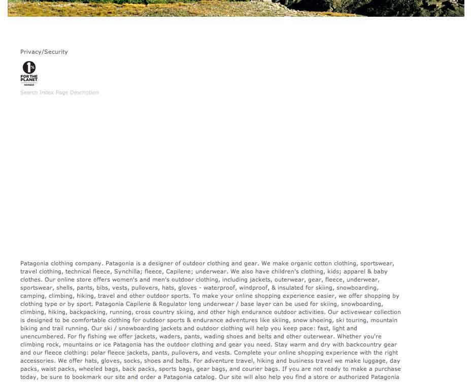
My instinct tells me that this tactic will fall out of favor with Google in the near future as the spiders advance and learn how to detect it. Until then, however, I expect this trend to continue to grow as more and more snake-oil SEO’s fall in line with what Match.com has made popular.
 SIGN UP FOR EXCLUSIVE WEEKLY CONTENT

Stephan,
Maybe I’m crazy, but I went to Match.com expecting to be apalled, but I have to say, I don’t see anything wrong with what they’re doing. Compared to the screen capture of Patagonia.com, it was well thought out, formatted, etc. Like you said of Patagonia, they put just a bunch of stuffed gibberish. I actually hope Google will see the difference in something like Patagonia.com and Match.com and leave the latter alone. But I certainly wouldn’t want to be accuse of being a snake-oil SEO! 🙂 JMOH!
Your post got me fascinated about this topic, so I did a Google search and found this interesting discussion about the same topic:
http://www.wolf-howl.com/grayhat-seo/hey-matchcom-trying-to-hide-some-text-below-the-fold/